Covista
A STRATEGIC REBRAND
In February 2026 Adtalem Global Education became Covista. I supported the rebrand visual direction internally working directly with our CCAO, CMO to build our brand guidelines and framework. While this rebrand gave us a distinct new identity in the healthcare space it went deeper strategically and was more than a new name, stock ticker and look—it redefined who the enterprise is and made our mission clear—to help close the healthcare workforce gap as America’s largest healthcare educator.
The Covista name represents a deliberate act of renewal—a signal of the organization’s evolution and a rallying cry for each of it’s five institutions to unite behind a higher purpose. It embodies collaboration (“co-“) and vision (“vista”), symbolizing our collective commitment to expanding opportunity and improving lives through education in service of healthcare.
BRAND GUIDELINES
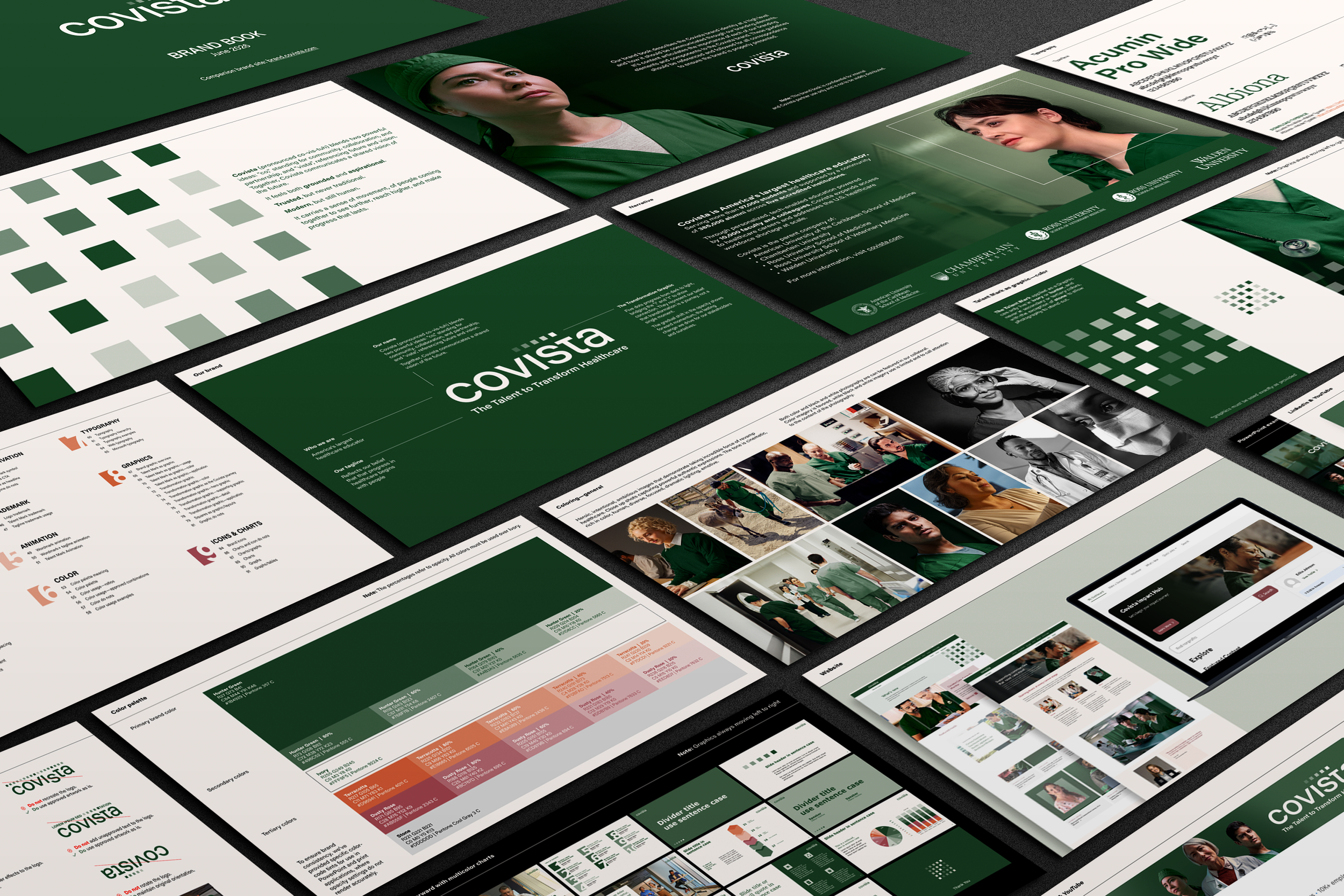
A 150+ page collection of all things Covista—from our brand foundation to more intricate details such as our logo and tagline usage, typography, color palette, endtag animations, photographic style and graphical adlob approach, social media, enterprise swag and internal asset templates such as powerpoint decks, email signatures, letterheads, alongs with do’s and don’ts for each. These guidelines set the standard for our enterprise and continue to evolve and improve as we grow our brand.
The condensed partnersite for our brand guidelines is live at brand.covista.com
BRAND PHOTOGRAPHY
When developing a new photographic look for our new brand, our goals were to feel cohesive, ownable, unique and authentic. Our imagery is unified by our brand color palette, highlighting hunter green across all scrubs. This intentionally stands out boldly in a sea of blue. The expressions used across our imagery conveys the dedication, determination and grit of our healthcare professionals. In our imagery we frame them as the new atheletes—they show up every day to sweat, strain and sacrifice for what they believe in. they put their bodies, minds and hearts on the line for others while embodying grit and endurance.
To build our brand imagery library we held proprietary photo and video shoots. In between asset shoots we’ve retouched stock to help expand and extend our library.









INVESTOR DAY & NYSE BELL RINGING
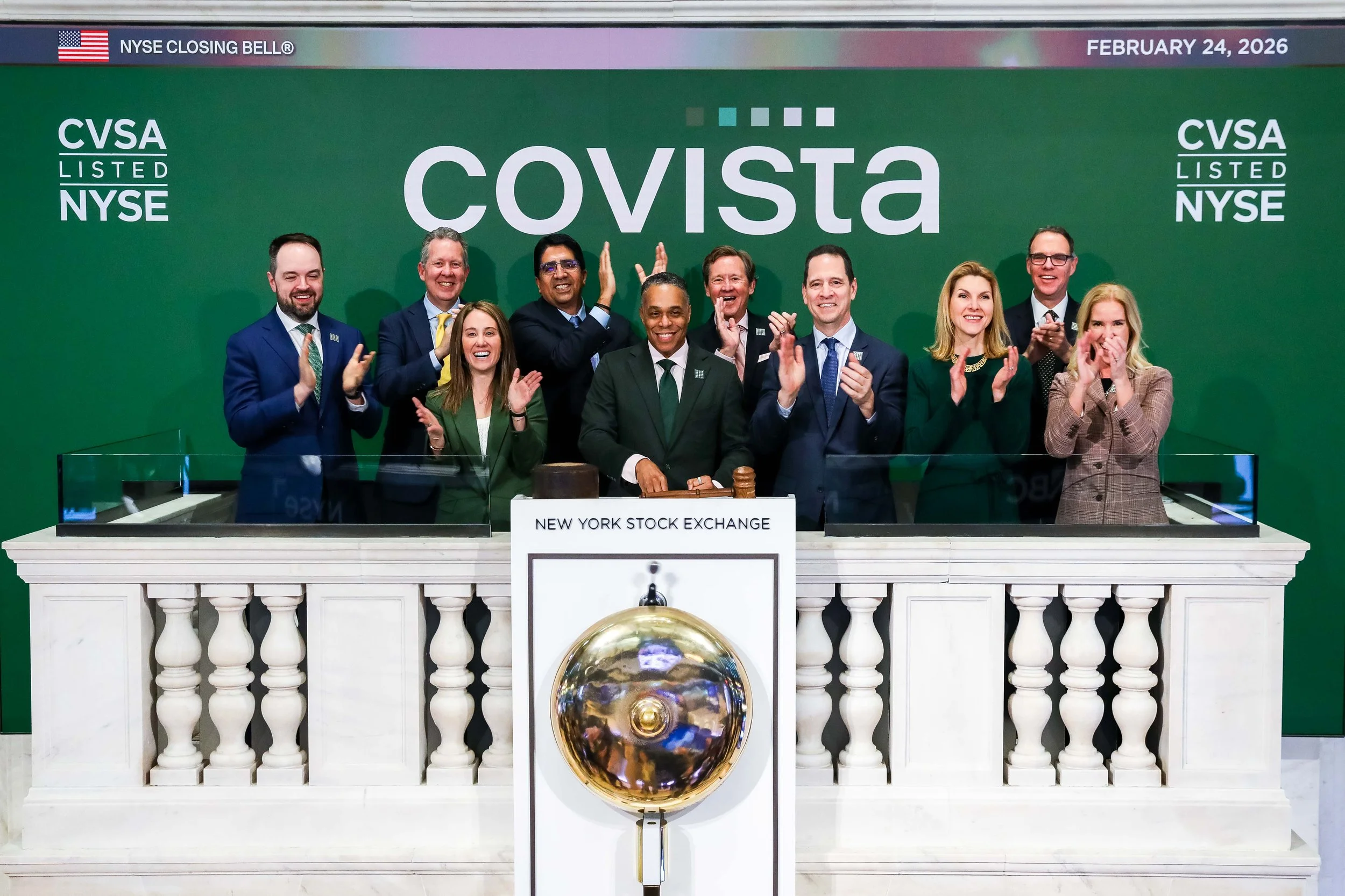
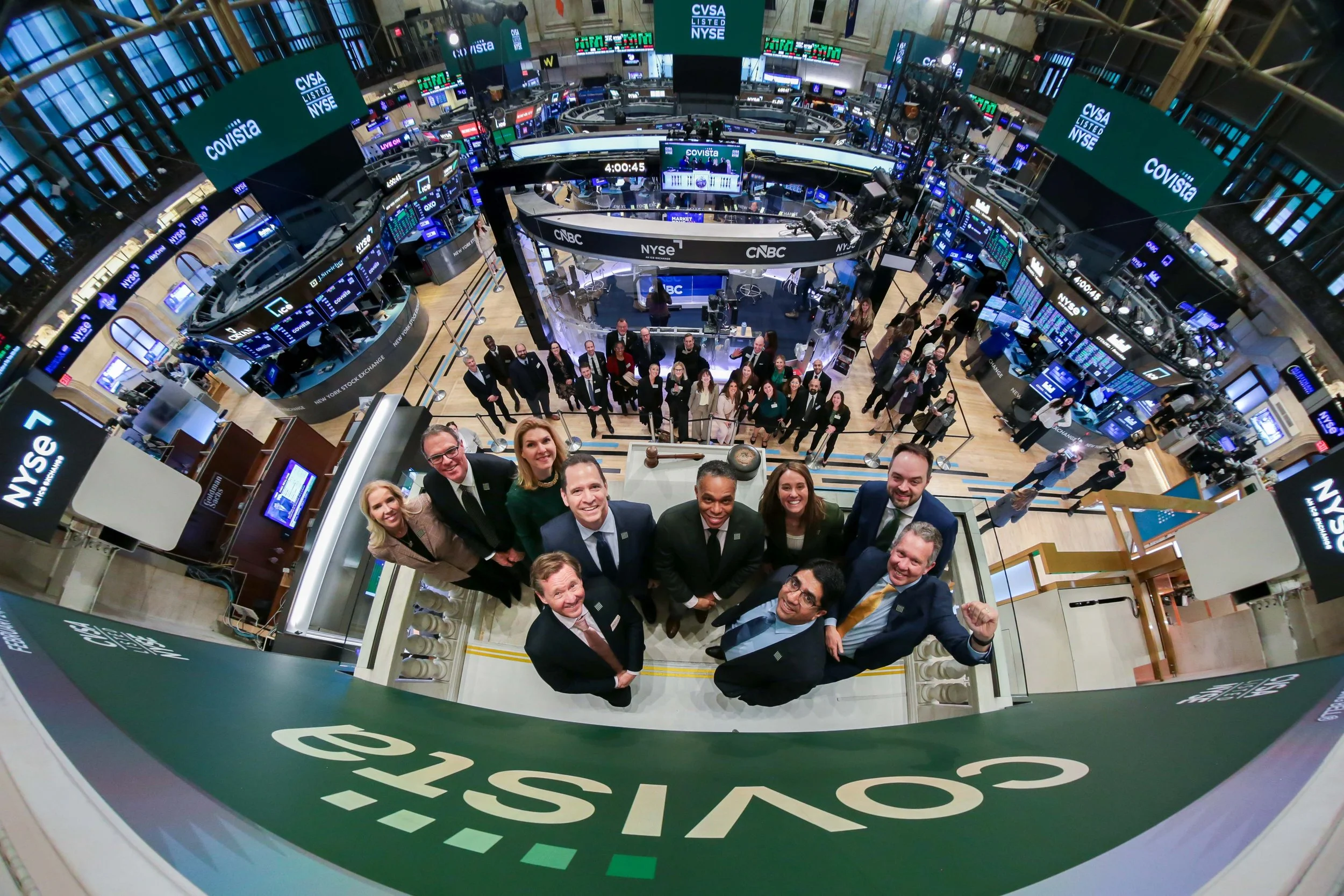
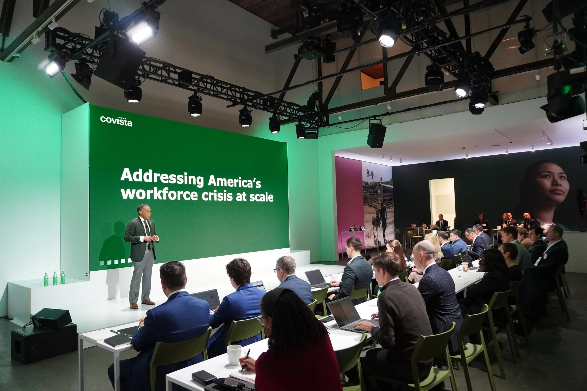
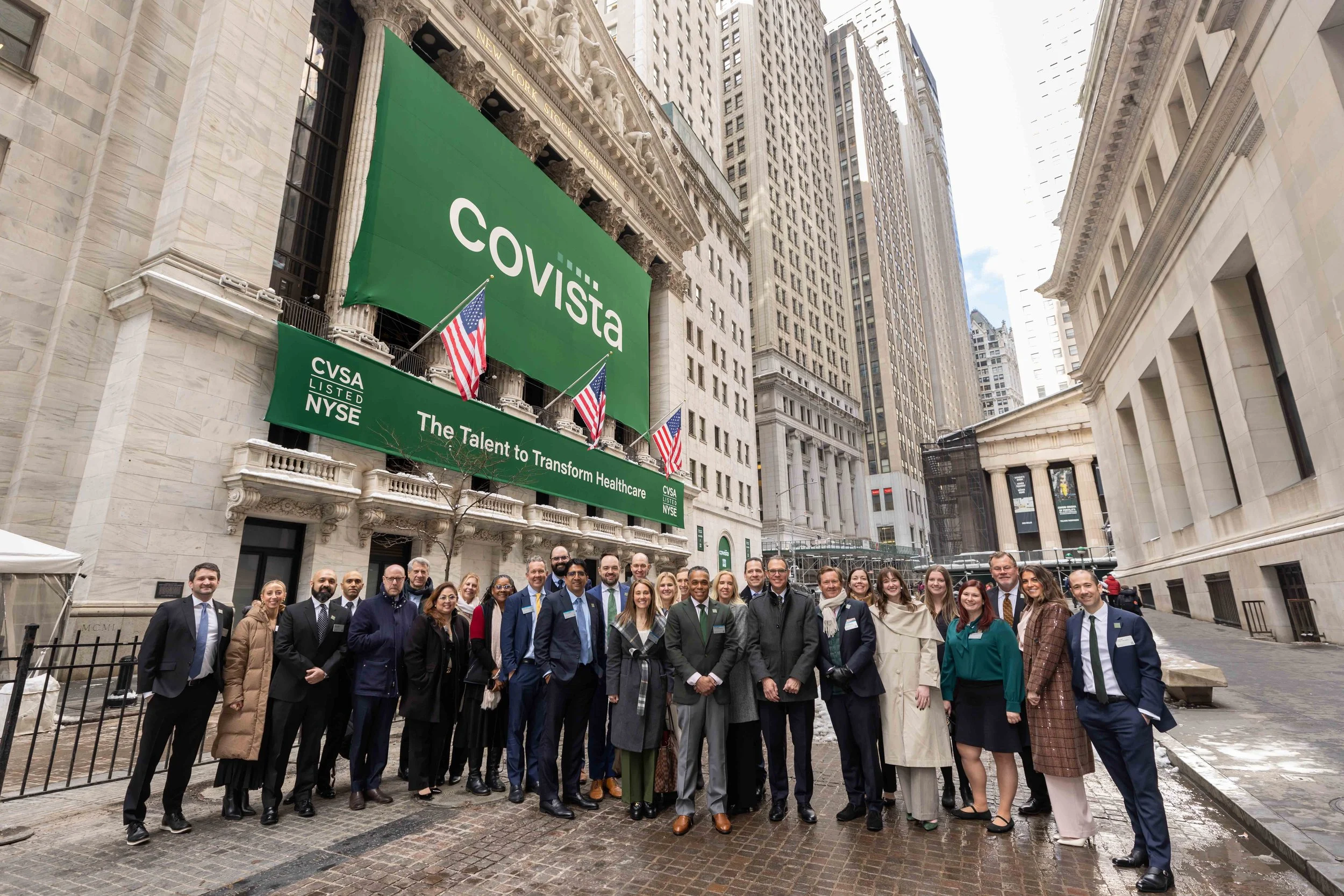
Mere weeks after our public debut as Covista, our executive team rang the closing bell at the New York Stock Exchange to commemorate our stock ticker change to CVSA and 30 years of public trading. Earlier the same day, Covista hosted an exclusive Investor Day in NYC’s financial district introducing Purpose at Scale, a three-year growth strategy focused on tackling the healthcare workforce shortage.
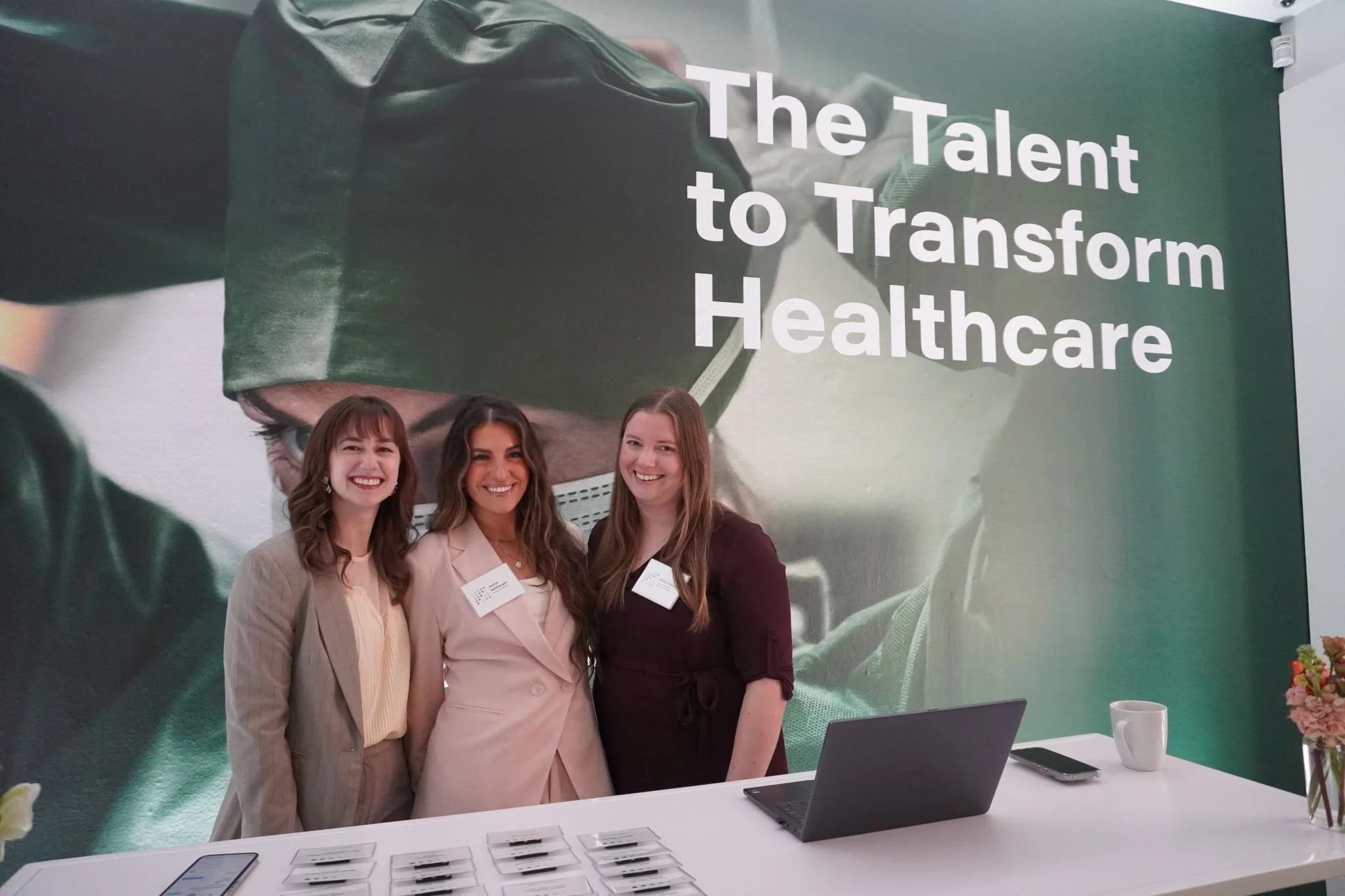
As lead on creative direction I oversaw that our brand was reflected consistently throughout all touchpoints including our Investor Day webcast, presentation deck, press release, launch videos, venue design, Times Square digital OOH, NYSE exterior and trading floor signage.
INTERNAL LAUNCH
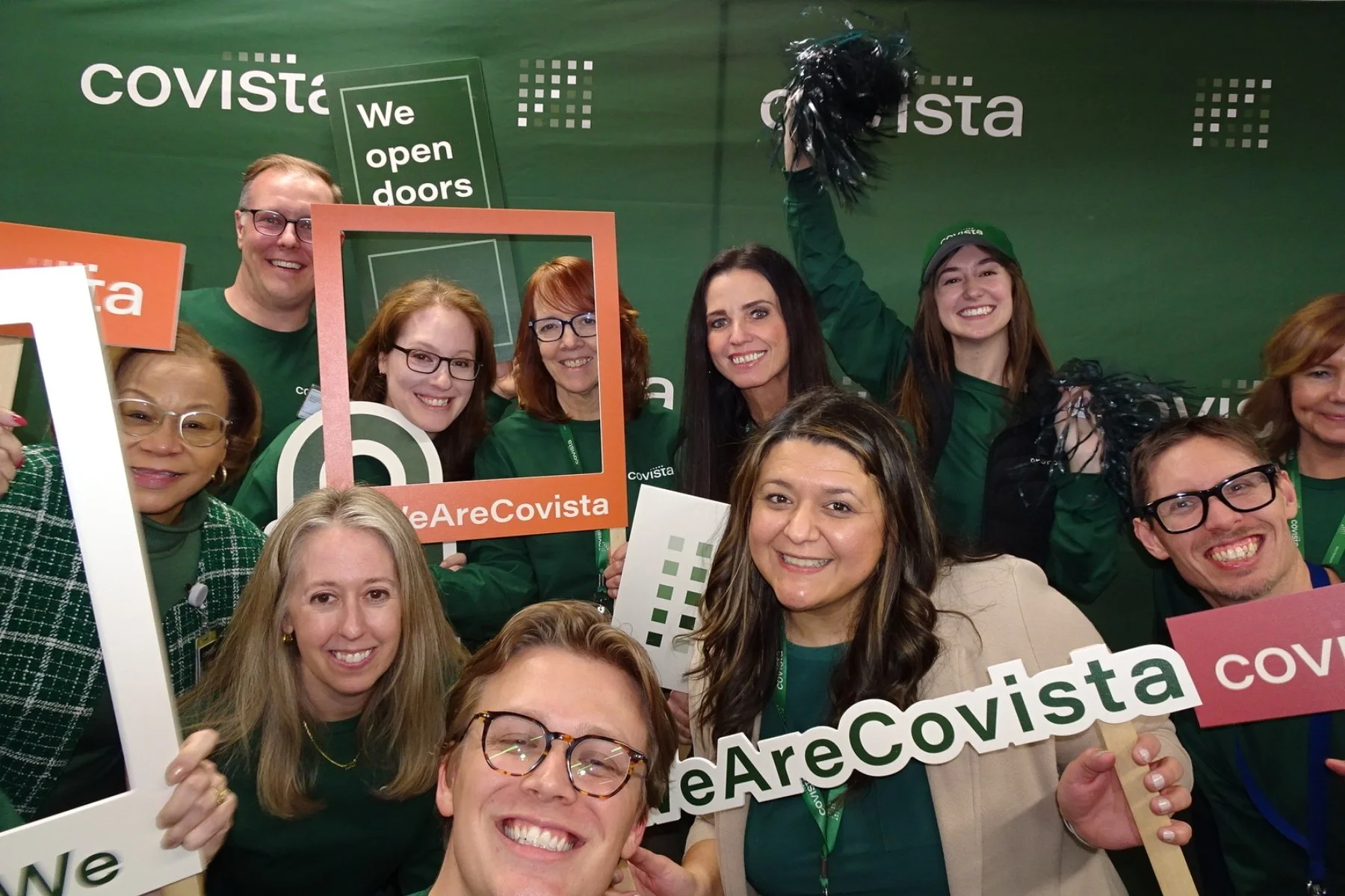
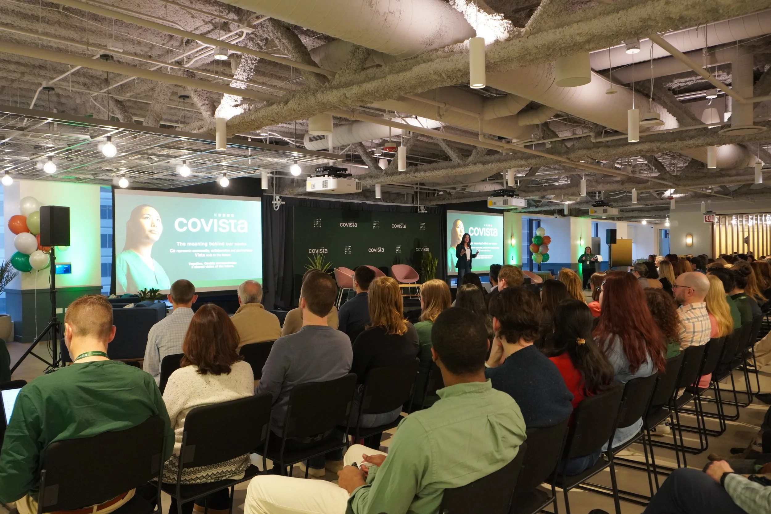
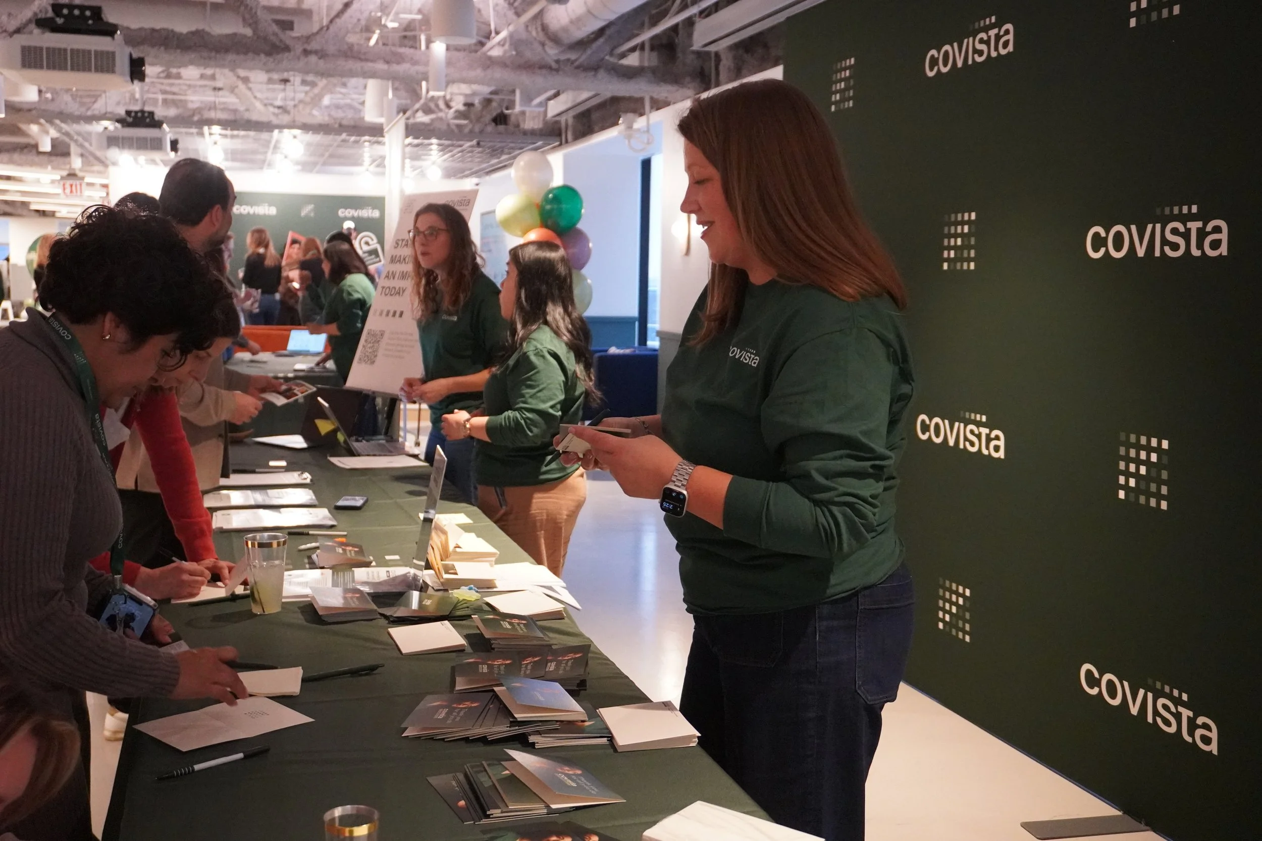
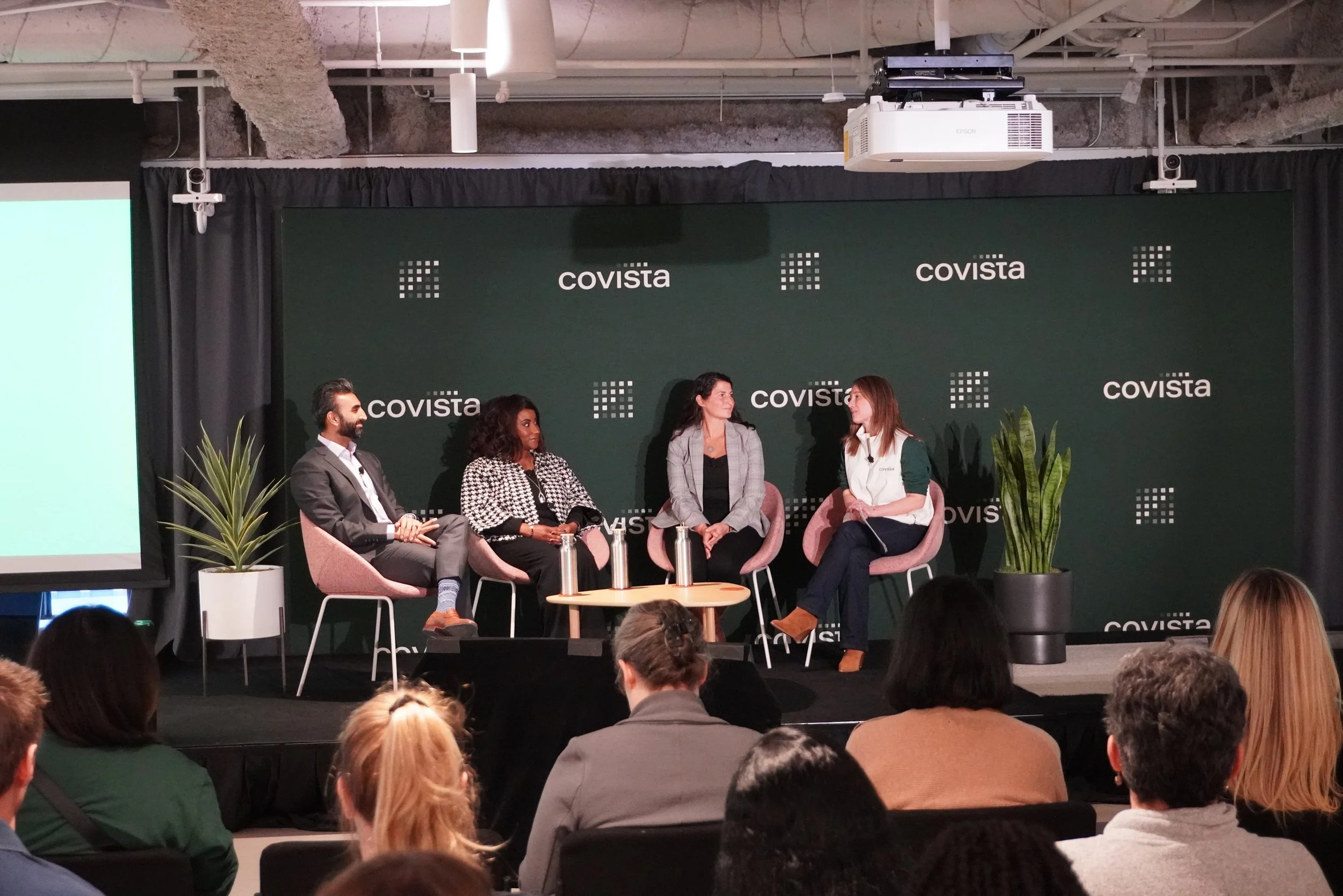
While our Corporate Affairs team and a few other groups in the NDA fold for the rebrand were hard at work for months leading up to the launch, the majority of our enterprise learned of our rebrand through an enterprise wide event spanning all our corporate offices and institution campuses with a live webcast, incorporating in segments from multiple locations.